Wednesday 1 August 2012

Behind the Bond


Information is Beautiful recently closed a challenge to visualise data from 50 years of James Bond movies. As ever I found the topic and data they provided really interesting so I could not resist giving it a go. Saakshita Prabhakar has already blogged about her entry so I thought I would do something similar and run through some of my decision processes.  

Some of my recent projects have involved some quite large datasets, so initially it came as somewhat a relief to have something considerably smaller for once. When working in this way the data must be really focussed to answer the key questions. For me the compelling question I really wanted an answer to was ‘Which actor made the best James Bond?’

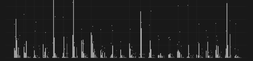
Much of the data provided appeared irrelevant to answering this question, number of Martinis drunk per movies didn’t hold my interest for long, although it was quite interesting to see Brosnan's movies contained a lot more killing and less kissing than the others. I eventually decided to narrow it right down to two really key bits of information, critics scores and box office revenue adjusted for inflation.


Without going into too much detail I experimented with a few ways to display these two sets of data. Ordering the movies along a common baseline seemed like the way to go to make comparisons easy, but this did not make for a very interesting looking visual. I wanted to incorporate a Bond theme into the visual style using predominately black, white and red, however this became impossible once I decided to represent each actor using colours. The final piece contains none of the theming elements I once hoped a James Bond piece would, and that for me is somewhat regrettable, however communicating the data is always my primary intention. I look forward to seeing other people’s approaches to the task.

Click here to enlarge

So what does the final piece tell us? Firstly it appears I am really out of touch with the critics, I grew up in the GoldenEye era and prefer the Brosnan movies over the others I have seen. These films however are considered some of the worst, but more surprisingly I discovered that Rodger Moore has an even lower average critic rating and dominates the bottom of the chart. Timothy Dalton, whose films were reviewed quite well, suffered badly at the box office. The undisputed master at playing Bond is Sean Connery who features heavily at the top in both cases. Daniel Craig is the second most sucessful Bond financially and has varied in quality according to the critics. It will be interesting to see how the response to the upcoming Skyfall this October will affect his legacy. 

Monday 23 July 2012

Round pegs and square holes

Circular forms have become a very fashionable method in an attempt to visually communicate data. Their popularity is somewhat perplexing given the additional challenges they present to both the designer and user, but it seams we just can’t get enough of them. Neither clarity nor efficiency appear to be issues of major concern when these forms are used, however perhaps that is where the secret to their success lies.

Olympic Evolution, Alicia Korn

I came across this piece by Alicia Korn a few months ago and was inspired to create an Olympic graphic of my own. Olympic Evolution displays the competing counties over the years. We immediately get a sense of enormous growth in participants from 1896 to 2008, and the absence of the event during the wars is stark, but some of the finer details become obscured by those curves. Looking at this we may assume that the number competing in the last four events has decreased slightly year-on-year, although without counting I expect this is quite the opposite and this illusion is due to the longer circumference of the outer most circles. Having the counties scattered like this makes it challenging to spot any abnormalities, for example can you identify the year the United States did not attend from the graphic alone? All the necessary information is present, but it is not ordered in a way we can process efficiently. The viewer is unquestionably challenged, but maybe that is why I feel so intrigued by it and ultimately rewarded once I have invested a little time. My favorite visualisations are those which immediately grab our attention and sustain our interest over time, and for me this wins on both counts.

When it came to creating my own Olympic visualisation, using data on gold medals won by nation and sport, I wanted to combine engaging visuals with deeper analytics, and not for the first time I decided to split the task in two by first providing an overview, followed by an opportunity to take a more in-depth look and discover the stories within the data. The circular section at the top will hopefully act as the bait, encouraging viewers to come closer and get a general sense of the scale of the data involved. The grids below are designed with clarity and efficiency in mind and should satisfy those who wish to drill down deeper. See the finished piece >here.

Gold, Ben Willers


Does it succeed? How could it be improved? As ever I am eager to hear any thoughts.

>
For further reading see my dissertation on area encoding >here.

Monday 4 June 2012

Lost in Space

Sharing work online can be a lonely experience. Presenting face to face will always generate some kind of reaction, but for all its size the internet sometimes feels very dark and empty, leaving me wondering how my efforts are being received. Page loads and unique visitors are rather crude measures of success, I would much prefer well considered, constructive thoughts left directly through the likes of Flicker or Visual.ly, but rarely does anyone take the time to do this. I am far more likely to uncover comments planted elsewhere, twitter for example, or like last week when I unearthed a brief discussion on my Eurovision piece on (of all places) an Arsenal football club forum.

Perhaps the biggest indication that my work has made an impact comes when others are inspired to create work based upon my own. This may be as straightforward as reusing a colour pallet I created, seen in this example by Jon Schwabish.

Top: Ben Willers.  Bottom: Jon Schwabish 


Sometimes a lot more is borrowed, my World of CO2 piece has clearly struck a chord with volkanolmez who has not only reused the colours for each country precisely, but also the title of the piece and time period from my original. To be honest I prefer my version for a number of reasons (which I will cover in a future post), but seeing my work inspiring others is very rewarding.

Left: Ben Willers. Right: volkanolmez


A more successful piece comes from David Heyman who replied shortly after my Eurovision piece was featured on the Guardian Datablog.
‘I was inspired by this graphic (and the availability of the data) to make an interactive / animated version. It's the same grid concept but the interactivity lets you define a custom date range or playback an animation.
I'm not sure I've gained any new insight into the data from presenting it this way (other than the obvious 'neighbors vote for each other') but maybe there's still something to be learned.’

I limited myself to ten years in my static version, but the interactive nature of this piece allows us to explore much further back than that. With a little effort and a keen eye we can uncover many more trends than I was able to in my attempt. I had great fun playing with various years selected to identifying at what point the UK became so unpopular.

David Heyman


I'm sure I am not the only one who likes to hear how their work has been received, so next time you see something that generates a reaction, don't be afraid to let the designer know.

Sunday 20 May 2012

Why I love Eurovision


A common misconception is that the beauty in visualisations comes from clever uses of colours, shapes and layouts. All are incredibly important things to consider for a piece to communicate efficiently, but without a solid foundation of really fantastic data a visualisation will always fail in my eyes. I dread having to visualise small tidbits data provided by clients as there is seldom any advantage in doing so and no opportunity to enhance the readers understanding.

That is why working on my latest project was such a pleasure.

The Eurovision Song Contest is an annual televised competition between European countries who each get to perform and vote for their ‘favorite.’ It’s well known that blocks of countries regularly exchange big points year on year to the same countries, although they would no doubt argue that is a result of sharing similar musical tastes. The most famous example is Greece and Cyprus who have awarded each other maximum points on every occasion in the past 15 years. Once I started digging through the voting tables I begin to uncover other startling consistencies, and once visualised a whole lot more began to emerge.

>Click here to enlarge

The final result highlights these voting trends even more clearly than I dared hope and shows off the real potential of visualising data. Whereas before we would need to intensively study and compare tables of numbers, the patterns now jump out and are impossible to ignore. I must admit I am quite excited for the 2012 contest next weekend (26 May). Not because of the singing of course, I will be following the voting and predicting who that elusive twelve points will be going to.

To see this and more of my work visit my website by clicking here: 
lifeindata.site50.net

Friday 27 April 2012

Visualising Data Day


I first became aware of Andy Kirk's visualising data workshops while studying for my MA last year, however pressures on time meant I never got around to attending. Having now earned my degree, found a job and with holidays to take I decided to visit a London event to help fill in some of the gaps in my knowledge. As these events are intended as an introduction to the subject I was conscious that we would be covering a lot of ground which I was already familiar with, however I was also keen to get an opportunity to discuss visualisation with others who have an interest in this field, something I have sorely missed since graduating from uni.

Many of the subjects covered in the early sections were indeed quite familiar to me, in fact it was amassing how closely it overlapped with the themes and examples used in my own >dissertation, including charts from Florence Nightingale and studies into visual perception from Cleveland and McGill. For everyone else in the room who had not read so extensively around this subject this would have been a real eye opener. For me it just confirmed how much reading I managed to cram into last summer.

Hearing Andy speak throughout the day from his own personal experiences while sharing his own thoughts was really interesting, and it is reassuring to know that both him and I appear to think along similar wavelengths. An example of this came up a few times when he mentioned the importance of leaving the reader feel rewarded, providing the reward is greater than the effort needed to decode the information. This is something I have touched on a number of times in my writing, including in the The Billion Pound-O-Gram analysis in my dissertation, and something I constantly strive to achieve in my own work.

Another highlight for me was the group tasks, especially when we were provided with a series of visualisations and were asked to evaluate them based on a number of criteria. Diversity within the groups ensured that on occasions we had to agree to disagree, especially on a visualisation by Krisztina Szucs examining movie Rotten Tomatoes scores, budgets and profitability, a piece I have previously examined >here. By far the most difficult task for me was right at the end when we were provided with a spreadsheet of both quantitative and qualitative data and were asked how we would set about visualising it. Once again a mixture of talents and backgrounds among those participating ensured a range of different and interesting responses.

Whether you are an aspiring data visualiser or have an apatite to grow further I encourage you to attend one of these events when one arrives near you. Failing that everyone should at least take a listen to a series of >podcasts from Enrico Bertini and Moritz Stefaner on which Andy has recently appeared as a guest.

Further information on these courses as well as a list of venues both in the UK and abroad can be found on the Visualising Data website >here.

Wednesday 25 April 2012

Stacking


I’ve lost count of the number of energy mix charts I’ve seen in the last few weeks, and practically all infuriate me. There have been pie charts in abundance that have succeeded in making the information completely unreadable, and the remaining stacked area and bar diagrams do a pretty good job of obscuring much of what is relevant or interesting. Take this fine chart for example:

http://www.justice.gov/atr/public/eag/232692.htm

The only values we can reliably compare are the total installed capacity and those for nuclear as these are the only two which share a common baseline. Take a moment to study the growth of natural gas (red) in the early part of the chart, as the elevation for each bar is determined by the values below it we are forced to judge each segment individually before making comparisons between it and its neighbours.

I recently came across some energy consumption data for the UK since 1970 and came up with an alternative method of display. The light grey bars are used to show the total energy consumption, and a breakdown of either the fuel type or sector are shown within. Crucially though all elements for comparison are shown along the same baseline which hopefully makes trends easier to follow.

Click here to enlarge

I did consider applying notes to this chart to highlight historical events that may have influenced the data, Thatchers election as prime minister in 1979 or the coal miners strike in 1984 for example. I don’t feel that my role is to provide all the answers though, just the facts in a digestible manner. I hope though that the well informed reader will make these connections themselves and as such will feel rewarded by their intelligence.


To see this and more of my work visit my website by clicking here: 


Update 1
Comments below make reference to the following images,
Image 1. Chris Twigg

Image 2. Ben Willers


Update 2
To read more about this visualisation click >here to visit The Guardian Datablog.


Tuesday 27 March 2012

You are all explorers now

I observe many infographics which serve no real purpose other than to convey a simple statistic that could quite easily be expressed in just a few simple words. These visuals are the bullet points in our field, spoon-feeding the reader with snippets of information that they are forced to accept at face value. While it is true that they serve a purpose as far as attracting attention, they do nothing to encourage exploration or allow the reader to contemplate deeply about the subject. I don’t have a problem with this practice as such, however it is important to carefully consider the needs of the audience and I see these types of visuals being used far more frequently than I think is useful. It would be easy to point fingers at the designer at this point, citing a lack of effort or understanding of the subject. The culprit though can probably be traced back to poor data selection from the outset. No matter how talented an individual is in bringing data to life, if that data is merely just a few predetermined percentages extracted from a paragraph of text there is little that can be done. On many occasions those asked to visualise this data would not be permitted to introduce new information of their own, possibly through fear that the visual will tell a different story from what the client intended. Designers are asked to mold this data in a similar fashion to an artist molds clay, except you wouldn’t provide an artist with poor quality clay from the Early Learning Center and expect a masterpiece.

Having worked within the journalism field for a few moths now I know of these frustrations first hand. I feel incredibly lucky though that I am given a reasonable amount of freedom to research around the stories we cover and introduce new data which I feel is worth exploring. Until now I have always created charts for articles that were being written, however my latest piece is from a dataset I stumbled across and though would be worth exploring regardless of its relevance to any particular current event. It examines 24 countries in Europe and their commitment to renewable energy. This is not designed to answer a predefined question or tell a story in a particular way. This lack of initial guidance therefore requires a certain amount of effort on the readers part, however the freedom this approach offers much appeal to myself and highlights the real potential of information design.

Click here for larger version — iPad users click here

Once again I have used per capita figures because I believe that this is the fairest way to compare countries of various sizes. More specifically I have used population figures of those of working age to show what percentage of the total workforce is employed in renewables. Likewise I have shown the amount of turnover from these sectors as a percentage of each countries GDP. I’m not going to offer any further explanation, I hope you will take a little time to scrutinise over it yourselves and make your own discoveries. As ever I would really appreciate any feedback on this as I hope to push this type of work in the future.

The article that was written to accompany this graphic can be seen >here